Empowering Users to Visualize and Customize Their Dream Homes

Sole designer of an academic mobile app project focused on streamlining home customization and improving communication between homeowners and designers.
Responsibility:
A stress-free, streamlined home design experience
Discover Your Style with Ease

Find the Right Designer Match

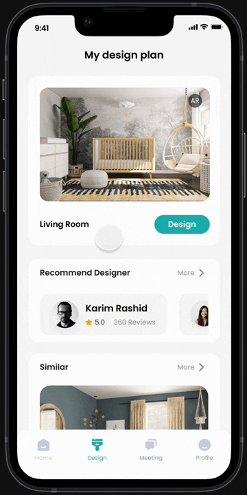
Visualize Accessories
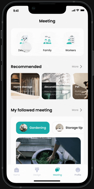
Seamless Communication
Empowering Effortless Home Design
The Challenge
“I didn’t know where to start, and every decision felt like a mountain. Communicating my vision was even harder—it became overwhelming.”
– Alex, a first-time homeowner

THE PROBLEM
Understanding Users: Insights from Research & Analysis
To build a solution grounded in real user needs, I conducted mixed-method research combining both quantitative and qualitative insights:
Online review analysis (e.g., Houzz, HomeAdvisor) — to uncover common user frustrations and recurring pain points across platforms
Quantitative questionnaires — to gather data on user satisfaction levels and past renovation experiences at scale
In-depth user interviews — to explore emotional drivers, expectations, and contextual needs in more depth


Together, these methods helped me identify critical experience gaps and unmet needs that shaped the direction of my design.

Users often feel their final space doesn’t match their initial vision due to poor planning or guidance.

Difficulty Matching Styles and Visualizing
Users lack confidence matching styles and visualizing layouts, needing better preview tools.

Home Is an Emotional Space
Users see their home as a deeply personal space, but current tools often overlook these emotional needs.

Key Insights
Users switch between multiple sources but lack a unified way to turn inspiration into actionable plans.
One-Way Communication
Most platforms don’t support real-time interaction or personalized feedback from professionals.
Lack of Real-World Context
Users struggle to imagine how designs fit their actual space, leading to uncertainty.
Low Decision Confidence
Lack of clear guidance—especially online—makes it hard for users to make informed, confident choices.
Identifying Pain Points and Opportunities
Key Pain Points
Too many options made it hard to define a clear design direction.
Lack of visualization tool
Users couldn’t preview designs in their real home context.
Finding the right team
Users struggled to identify designers who matched their needs.

Fragmented Planning & Communication
Lack of coordination led to delays and confusion.

Filter and save preferred styles through a curated inspiration library

Connect with designers, manage meetings, and track progress

Preview accessories in real home environment
Crafting Persona and Journey Map


Discovering My Style
Lisa explores the app to find a design direction that fits her taste. She browses a curated inspiration library, applies filters like room, style, and color, and saves her favorite looks. By the end, Lisa has a clear shortlist of preferred styles, giving her confidence and direction for her home project.
When designing the browsing flow, my goal was to help users like Lisa explore and save design inspirations in a way that balances visual immersion with efficiency. I explored two main layout options:
Option 1 - Vertical Cards
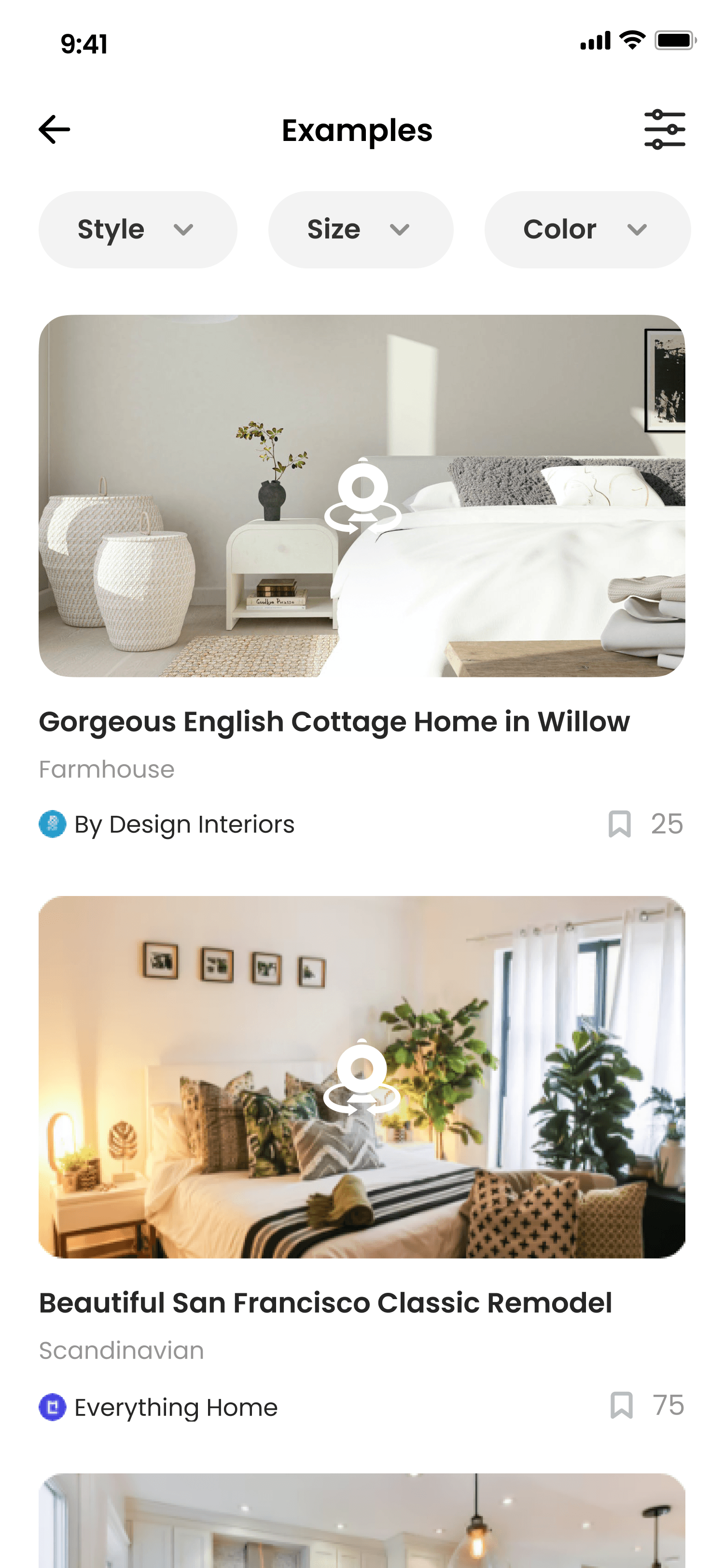

Familiar and easy for mobile users
Emphasizes large images (good for visual inspiration)

Harder to scan many examples quickly
Option 2 - Grid View
Users can view more designs at once
Good for pattern scanning and quick comparison
Smaller image previews (less detail)
Harder to show full text info
After testing both concepts, I chose the Vertical Cards layout, as it best meets users’ need for visual immersion and supports confident, extended browsing.
✅ Large, detailed image cards for stronger inspiration impact
✅ Simple, intuitive top filter pills to tailor results
✅ A save-to-board feature, allowing users to collect and review favorite styles
Visualizing My Space
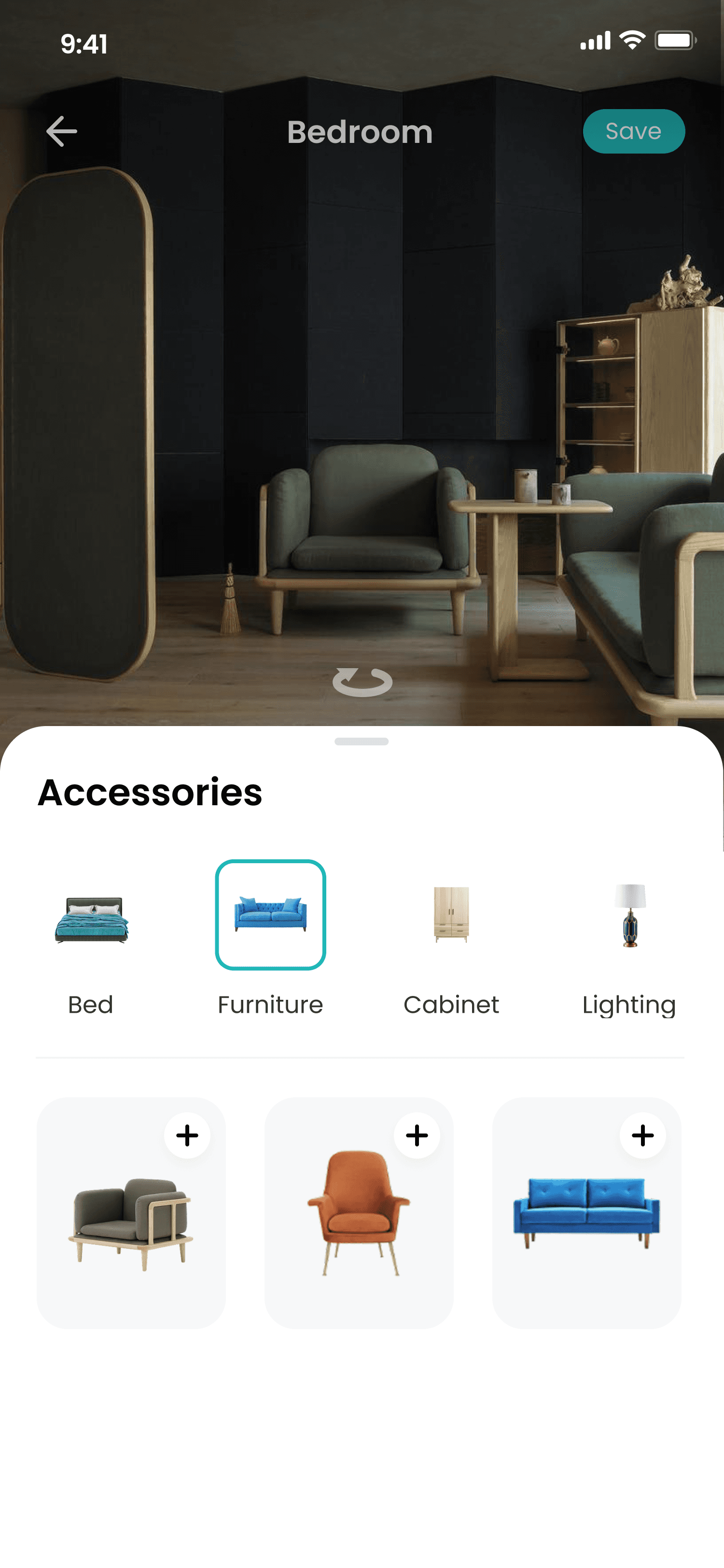
In Stage 2, Lisa uses the app’s design editor to test how accessories, lighting, and wallpaper would look in her own room. She selects her space, adds items from the library, and adjusts their placement and size for a realistic preview. This helps Lisa experiment with different styles and see how everything fits together. By the end, she feels confident in her choices, knowing they suit her space before making a purchase.
When designing the accessory visualization flow, my goal was to help users like Lisa easily explore, add, and adjust items in their space without disrupting the immersive 3D experience. I explored two main layout options:
Option 1 - Bottom drawer
Thumb-friendly on mobile
Room view stays central , and the top area remains uncluttered for spatial editing.
Limited space for filters or categories
Harder to scale
Option 2 - Vertical Panel

High visibility: Shows all categories and items without scrolling sideways.
Scales better
Blocks main room view: Reduces immersive interaction with the 3D scene.
Not thumb-optimized
I chose the Bottom Drawer layout to give Lisa an immersive editing experience, letting her focus on the room while easily reaching accessories with one hand.
✅ Bottom drawer with horizontal scrolling for quick category access
✅ Clear, central 3D room view for better spatial editing
✅ Thumb-friendly interaction designed for mobile use
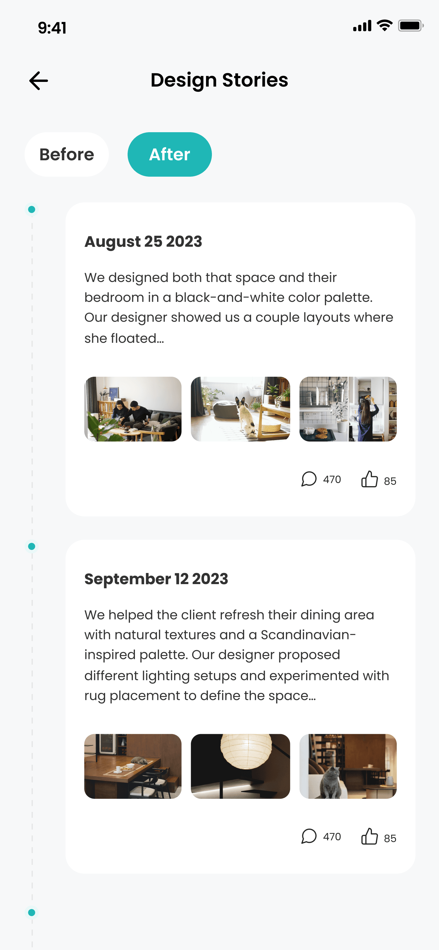
In Stage 3, Lisa browses designer profiles, exploring past projects, ratings, and client stories to find someone who matches her family’s style and needs. She also reviews design stories to understand each designer’s approach and looks at before-and-after examples to see the real impact of their work.
To help users like Lisa better understand a designer’s work, I added a Design Stories section showing before-and-after transformations with key project details. I explored two layout options to present this effectively.
Option 1 - Timeline
Shows chronological progression
Supports text detail like process, client notes, tags
Not optimized for side-by-side comparisons
Slower for scanning multiple transformations
Option 2 - Gallery

Showcasing design impact at a glance
Easy to scan and emotionally engaging
Limited space for narrative or deep text description
After comparing both, I chose the Gallery layout to create an experience that’s both visually powerful and emotionally engaging, helping Lisa feel confident and inspired when choosing the right designer.
✅ Before-and-after galleries to communicate transformation instantly
✅ Mobile-friendly, swipeable interface for easy, emotional engagement
✅ Light timeline elements to highlight process milestones
To help designers better understand client needs, I added a Home & Family information section where users can input details relevant to their project.
Option 1 - Scrollable Form
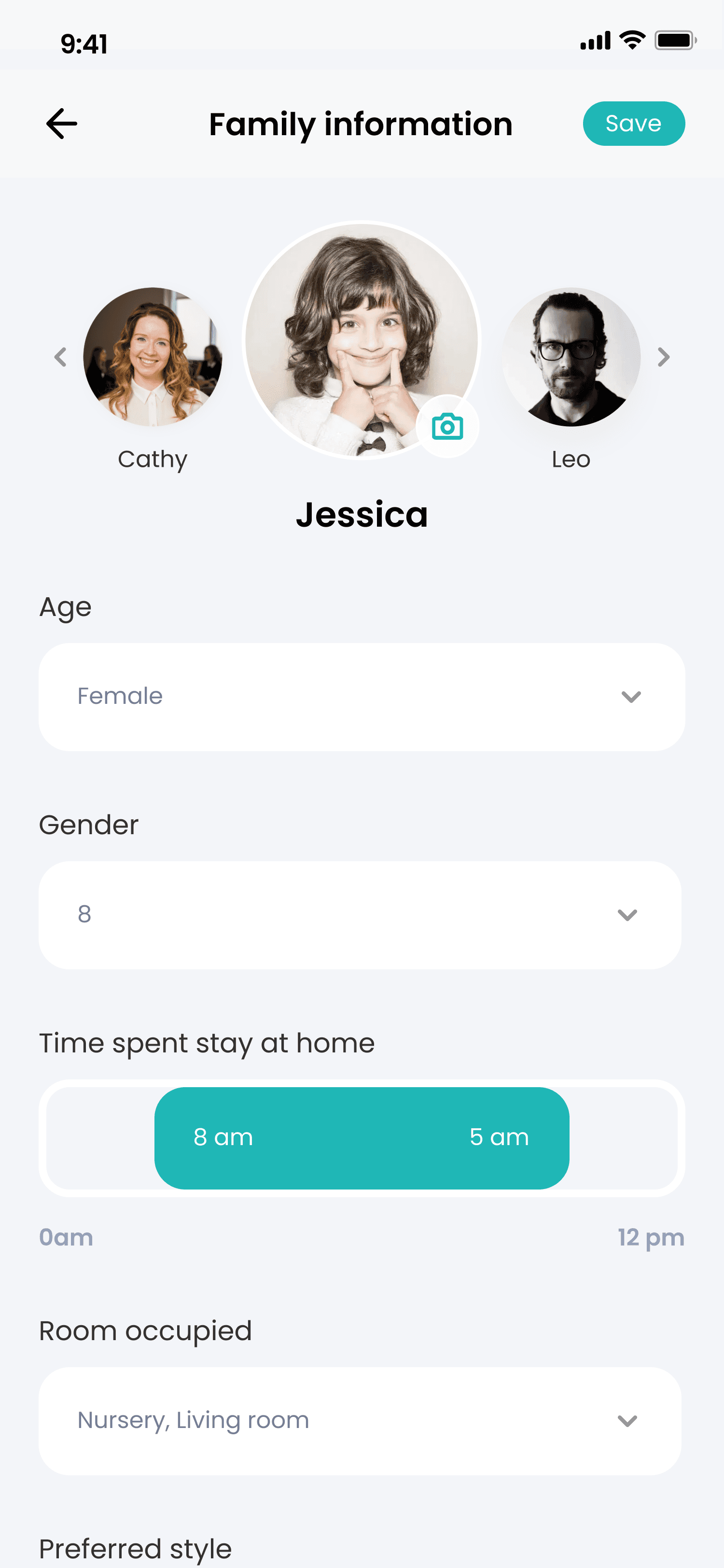
Faster to complete; users can review and input all fields at once
Easy to switch between family members with head tab
Good for users who want a full overview before submitting
Can feel overwhelming with too many inputs
Option 2 - Step-by-Step Wizard

Reduces cognitive load by focusing on one section at a time
Feels more guided and interactive
Slower to complete due to extra steps
Harder to jump back and edit answers
After comparing both, I chose the scrollable form layout. The key reason was to prioritize speed and flexibility, especially for users managing multiple family members.
✅ Continuous form for quick input and review
✅ Head tab for easy switching between family members
✅ Clear sectioning to reduce overwhelm while keeping everything accessible
Booking & Moving Forward
In Stage 4, Lisa schedules a consultation where the designer shares concepts, mood boards, and 3D visuals. Together, they discuss feedback, materials, and how to maximize her space. Once aligned, Lisa confirms the hire, sets the project schedule, and tracks progress through shared tools, feeling informed and supported as the project officially begins.
To help users like Lisa track progress, schedule tasks, and communicate smoothly with designers, I designed a dedicated Project Hub section. This space allows Lisa to check what’s been done, see upcoming milestones, and stay in sync with her designer.
Option 1 - Calendar

Clear date-based view — easy to see when things happen
Good for coordinating schedules and availability
Harder to see overall project progress or multi-phase flow
Option 2 - Timeline
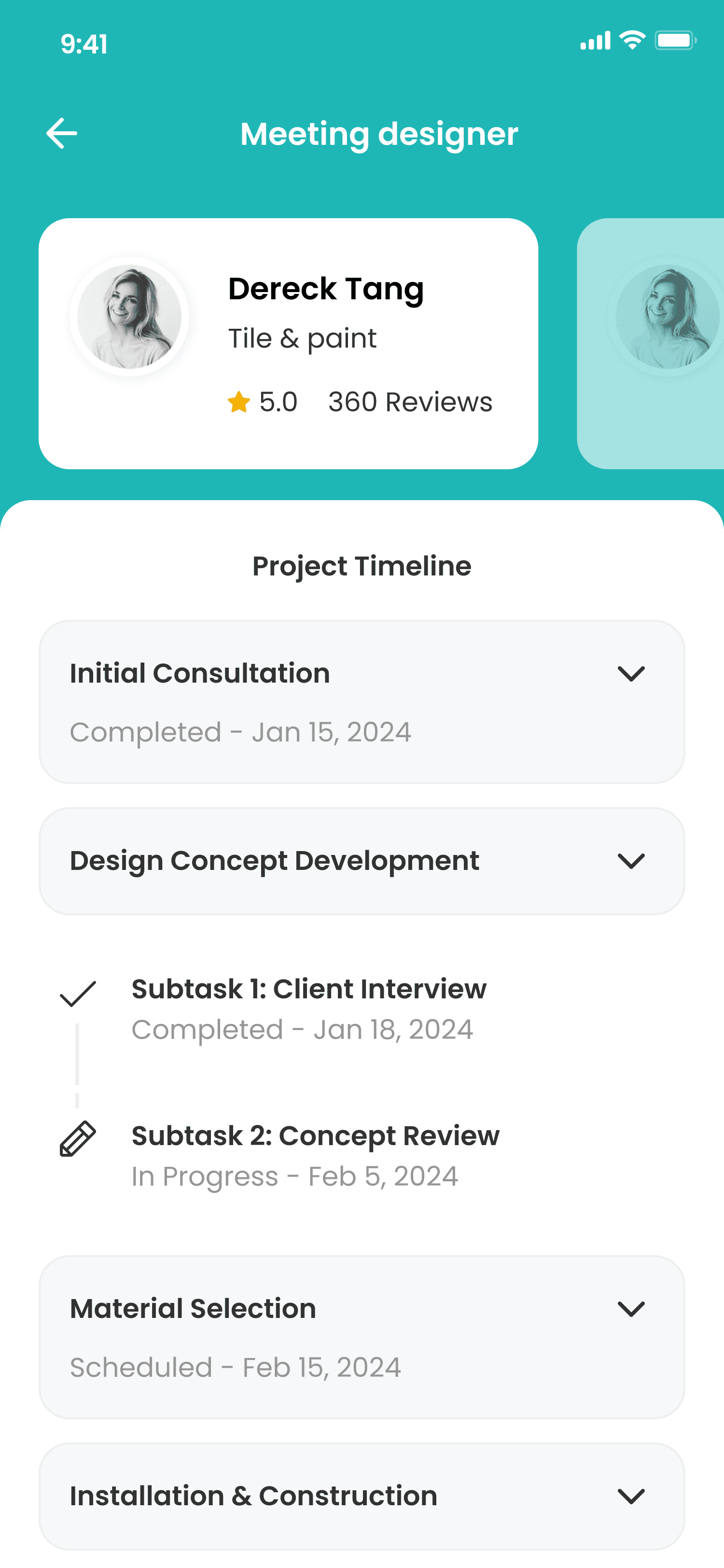
Clear sense of project stages and flow
Great for understanding task progression and milestones
Weak on date-specific details — not tied to a calendar
After comparing both, I chose the Calendar layout because it gives users like Lisa clear, date-based visibility, helping her easily see when things are happening.
✅ Tabbed layout to easily switch between progress tracking, schedule, and communication
✅ Integrated progress updates tied to real dates to show what’s done and what’s next
✅ Messaging tools / chatbot for real-time communication with designers
